Thank you for the blog, Hsi! Great job on your first assignment.
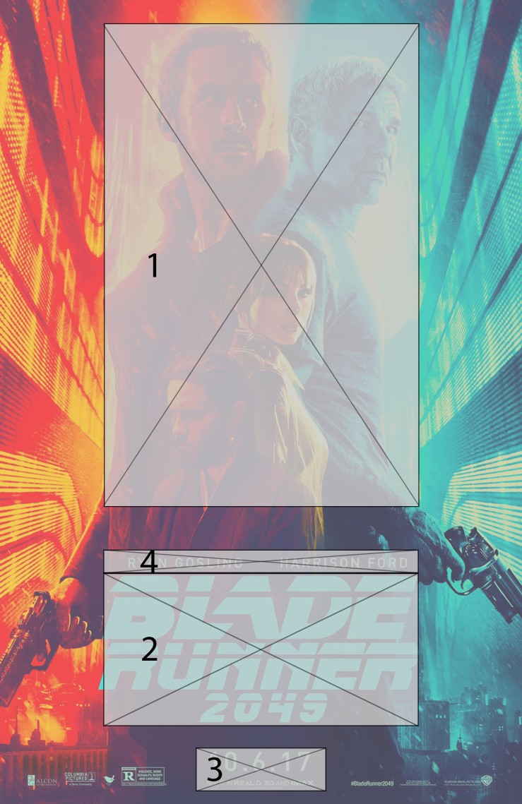
As we discussed in class, try doing another stab at the hierarchy by grouping “Blade Runner 2049″ as one lockup. Albeit, the main image takes up most of the content, the cyan colors of the title block is calling out more than the main image. A good way to determine a hierarchy of information is by squinting your eyes and seeing the elements in blurry blocks. Notice how everything recedes while the title block pops out when you do it.
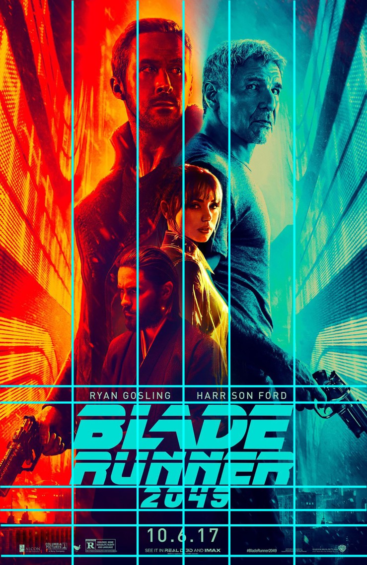
For the grid, every column in the main content should have the same width. With this poster, there might not be a sophisticated grid system. It looks like the designer focused on centering and splitting images from the center.


Thank you for the blog, Hsi! Great job on your first assignment.
As we discussed in class, try doing another stab at the hierarchy by grouping “Blade Runner 2049″ as one lockup. Albeit, the main image takes up most of the content, the cyan colors of the title block is calling out more than the main image. A good way to determine a hierarchy of information is by squinting your eyes and seeing the elements in blurry blocks. Notice how everything recedes while the title block pops out when you do it.
For the grid, every column in the main content should have the same width. With this poster, there might not be a sophisticated grid system. It looks like the designer focused on centering and splitting images from the center.
LikeLike